Most sites these days will benefit from having sharing options to social networks. Twitter, Facebook, Google+, and Instagram, to name a few, make it super simple for developers to include sharing buttons and, when used in conjunction with Facebook's Open Graph and Twitter Cards meta data, it makes for a rich experience on social networks.
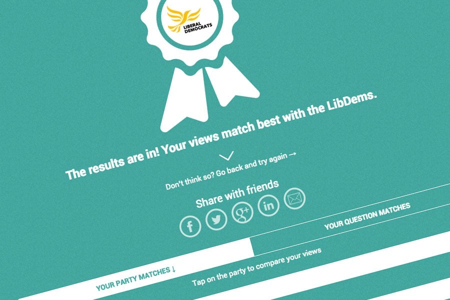
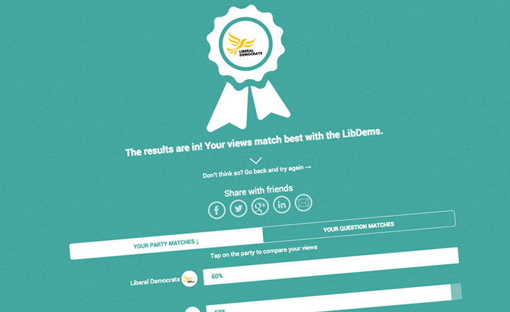
For VoteMatch we had to take this a little further so that people's experience was not broken when it was embedded on a third-party site. VoteMatch has been designed to cope with any screen size or device. This lends itself to being offered as an embedded iframe so that other sites can host the quiz. By copying some simple code any website can host the quiz but this raises the question of how the sharing links should work.
When a person uses the sharing links from the embedded version, where should the return links go to? Should they return a user to the VoteMatch app outside of the website in which it was embedded or should they return a user to the website that is hosting the embed?
National Scale White-Label Architecture: From Zero to Telegraph in 48 Hours
VoteMatch demonstrates our capability to build platforms that achieve viral scale through strategic white-label architecture. Within 48 hours of launch during the 2015 General Election, the platform was adopted by The Telegraph (23 million monthly readers), The Independent, and Huffington Post UK, requiring sophisticated embedding technology that maintained brand integrity for each media partner whilst centralising data and infrastructure.
The technical challenges were substantial: dynamic parameter passing for custom return URLs, real-time social sharing that preserved partner attribution, iframe security whilst enabling cross-domain communication, and infrastructure that handled 100,000+ concurrent users on election night with zero downtime. This wasn't theoretical white-label capability but battle-tested architecture serving the UK's leading media outlets during a national election, proving our expertise in building platforms designed for viral distribution through media partnerships.
View the complete technical architecture: VoteMatch: National Election Platform
We chose the latter
We wanted to make sure that there was no loss of traffic for the third-party host site. It seems only fair that, if they have taken the time to host the site, the sharing links return people back to the host page rather than a stand-alone version of VoteMatch. This decision proved critical when media partners like The Telegraph embedded VoteMatch for their election coverage - their editorial teams needed confidence that viral social sharing would drive traffic back to telegraph.co.uk, not away from it.
To make this happen the embed code needs to be a little more intelligent. This involves having to set a couple of parameters when embedding the site.
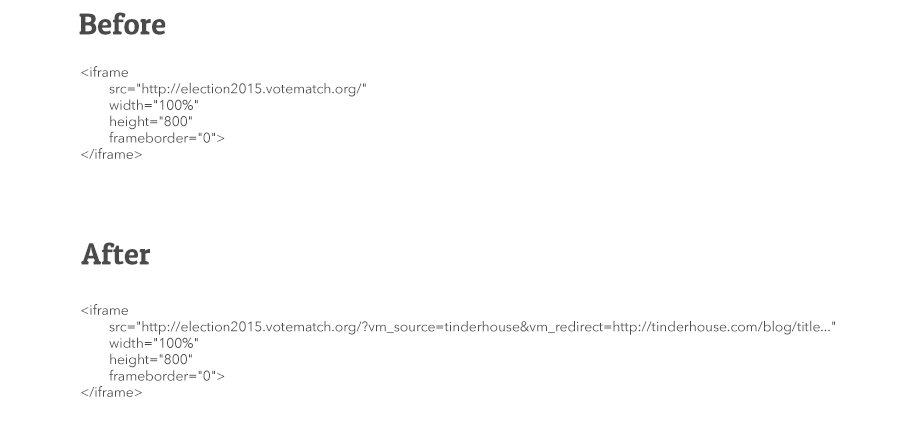
From a code point of view, this small change lets us personalise the return links in each embedded version of the site. In order to support these extra parameters, the VoteMatch site has been adapted to use them when they are present and in turn ensure that all inbound traffic from social media brings people right back to the host page with the embed.
The sample code above is exactly what we are using to embed the quiz below. If you're unsure of who to vote for in the 2015 General Election then give it a try. All from within the Tinderhouse blog!
Three key messages to take away
- Cover the basics and make sure that your site is set up to use Twitter Cards and Facebook's Open Graph. Visitors to your site will be sharing page content on social networks so make sure it looks great when they do.
- Keep in mind how the shared content will be read. When viewing Twitter Cards within the Twitter app you don't, at first, see the whole message or picture. Make sure you get the key message across in this first interaction.
- Personalise what can be shared. Tailor the message and any pictures to help people sharing content stand out from the crowd.
How this played out
The white-label architecture described here enabled VoteMatch to be embedded across multiple high-traffic media sites simultaneously during the 2015 General Election, all feeding data back to a central repository. Academic analysis confirmed these "formal partnerships between VoteMatch and Verto with the Telegraph, Huffington Post and Independent." For the complete technical story—including how we handled 100,000+ concurrent users - see our VoteMatch case study.
Need an app or website?
Get in touch to discuss how we can help create an app of your own or find out how our Fractional Product Team can support your development journey from MVP through to scale.
