Tinderhouse recently launched VoteMatch, which was designed as a mobile-first web app. The platform went on to handle over 100,000 concurrent users on election night and was white-labelled by The Telegraph for their election coverage - you can read the full VoteMatch case study for the technical details.
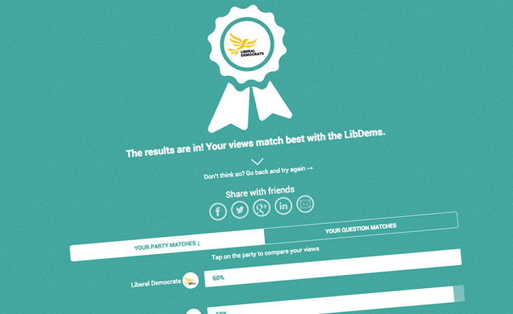
VoteMatch is a simple quiz to help you to find the political party closest to your views. From the start of the project we had mobile users in mind and, in turn, made sure that the desktop experience was just as rich. By taking a mobile-first approach we could also ensure that the web app was easy to engage with across social networks.
Device patterns
Through our analysis of the Google Analytics statistics, we have been observing some strong trends around the use of mobile devices. The statistics have validated our mobile-first approach and some interesting patterns have developed. The site has a natural ebb and flow of mobile devices throughout the day. The trends break down into obvious but crucial periods that each have a bias.
Early morning - mostly mobile
Daytime - mostly desktop
Evening - mostly mobile
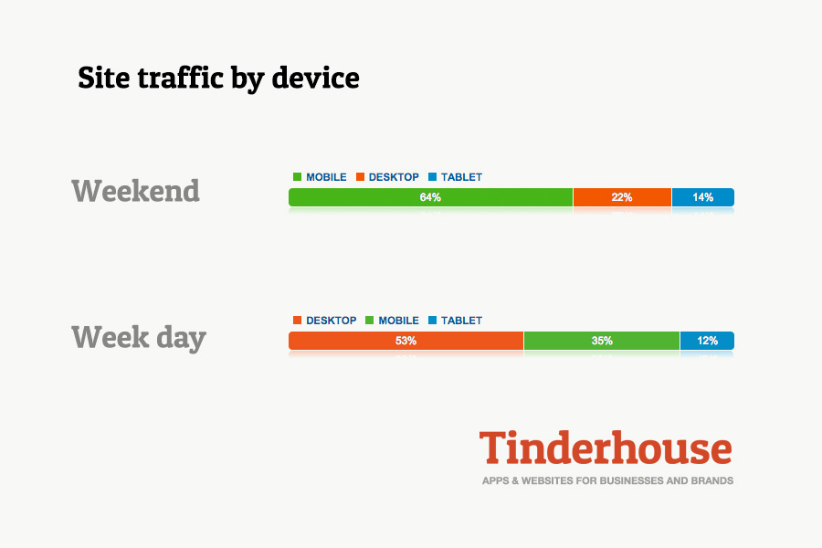
Weekend - mostly mobile
Proven Scale: From Zero to National Media Partner in 48 Hours
VoteMatch demonstrates our capability to build platforms that achieve viral scale under intense scrutiny. Within 48 hours of launch during the 2015 General Election campaign, the platform was white-labelled by The Telegraph (reaching 23 million monthly readers), adopted by The Independent and Huffington Post UK, and processed millions of quiz completions with 100,000+ concurrent users on election night - achieving zero downtime. The mobile-first architecture enabled seamless embedding within Twitter's native app, driving viral growth through social sharing whilst maintaining sub-second response times. This wasn't theoretical mobile-first design but battle-tested infrastructure serving a nation during a General Election, validating every architectural decision under the most demanding real-world conditions.
View the full technical case study: VoteMatch: National Election Platform
What we mean by mostly is that over 50% of visitors are on either mobile or desktop at any time. Throughout the day, there is a consistent minority of tablet users. The early morning bias on mobile devices can easily be explained by people's daily commute to work or catching up on news over breakfast.
The daytime bias to desktop has an equally obvious explanation: most people have arrived at work and have settled down in front of their desktop computers.
The evening bias back to mobile devices starts with peoples' commute home and continues throughout the evening.
The weekend bias to mobile devices helps to validate our mobile-first approach. It's quick and easy to take the quiz, which in turns drives more social network sharing and more users.
Embedded in social networks
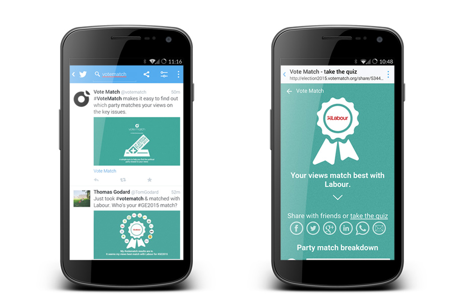
We have found that many users are experiencing VoteMatch entirely within Twitter's own app. As you would expect, VoteMatch lets you share your results on Twitter or Facebook. The social media shares include a link inviting the reader to take the quiz themselves. When following this link from within the Twitter app, it loads VoteMatch directly within Twitter's own app and, since it's mobile first, the user can get straight down to taking the quiz themselves. All within Twitter's app.
This has been a key driver of the mobile device statistics and has helped VoteMatch to gain traction across social networks. By keeping the experience within Twitter, the quiz has been taken by more users who in turn share with more users.
Three key messages to take away
- People will be using multiple devices to access your website. It's now a fact of life! The device may change over the course of any given day but the experience should be maintained.
- Don't be scared of taking a mobile-first approach on your next web project. There are clear benefits when it has been designed into the project.
- Keep the transition between social media apps and your website seamless and, where possible, don't transition users at all.
The bigger picture
This article captured our real-time observations during the 2015 General Election campaign. The mobile-first approach we describe here was central to VoteMatch reaching millions of voters and being adopted by major media partners including The Telegraph, The Independent, and Huffington Post. For the full story of how we built infrastructure to handle national-scale traffic with zero downtime, see our VoteMatch case study.
Need an app or website?
Get in touch to discuss how we can help create an app of your own or find out how our Fractional Product Team can support your development journey from MVP through to scale.


