A multi-phased voter information portal designed to bridge the democratic information gap for the London School of Economics.
What we did
- Strategy and Information Architecture: Mapping complex nested UK geographies to intuitive user journeys.
- UX/UI Design: Creating a "dashboard" feel that remains accessible for low-information voters.
- ExpressionEngine CMS Development: Building a robust, high-performance backend capable of handling millions of data points.
- Data Visualisation: Implementing interactive maps and charts to translate spreadsheet data into actionable insights.
- API Integration: Connecting with third-party services like YourNextMP.com for real-time candidate updates.
- Performance Optimisation: Ensuring the platform could handle massive spikes in traffic during election cycles.

About the project
The Democratic Dashboard is a flagship initiative run by Democratic Audit UK, an independent research organisation based within the London School of Economics (LSE) Public Policy Group. Led by Professor Patrick Dunleavy and Dr Jonathan Hopkins, the project seeks to transform how electoral information is communicated to the British public. Research conducted by the LSE highlighted a critical need for this platform: the UK has historically suffered from one of the lowest rates of electoral participation by young people in the OECD. The Dashboard was conceptualised to use the digital environment to spread engagement and provide a "one-stop-shop" for voters who are increasingly geographically mobile and disconnected from local political contexts.
In the 2015 election cycle, the team utilised an MVP development strategy to test the market appetite for localised voter data. While that initial version was successful in terms of traffic, it was built on a restricted WordPress foundation that struggled with the complexity of nested geographies. Tinderhouse was commissioned to rebuild the platform from the ground up as a permanent resource, evolving from an MVP approach into a comprehensive bespoke web system capable of handling the 2016 "Super Thursday" elections and subsequent 2018 local polls.
The Challenge
The primary obstacle for the relaunch was the sheer volume and complexity of the data required to inform a disillusioned electorate. In the UK, democracy is a patchwork of different geographies, electoral systems, and election types, making it an onerous task for even the most engaged citizens to find accurate information.
Key pain points included:
- Deep-Rooted Disengagement: LSE data revealed that 395 constituencies had all-male, all-white MPs since 1992, and 388 "safe seats" had not changed party hands in over 25 years, contributing to a sense that individual votes lack influence.
- Database Rigidity: The existing WordPress setup was inflexible and could not handle bulk updates or the relational data needed for every level of UK democracy.
- Mobile-First Requirement: With over 52% of users accessing the site via mobile or tablet, the "dashboard" feel had to be perfectly responsive to ensure accessibility for younger, mobile-dependent demographics.
- Speed and Scale: The site needed to remain lightning-fast even when serving 50,000 page views on a single day, particularly during high-stakes election nights.
- Information Scarcity: According to Google Trends, the top election day searches are "Who are my local candidates?" and "Where do I vote?", indicating a "yawning information gap" in local elections.
Our Solution
Transitioning to Enterprise Scale
Building on the lessons learned from the initial minimum viable product strategy, we moved the platform to a more robust architecture. We chose ExpressionEngine as the core CMS because of its ability to handle custom data channels and its proven performance in high-traffic environments. As experienced ExpressionEngine developers, we built a data hub that could be updated via bulk spreadsheet imports or manual entry, giving the LSE team total control over the accuracy of their reporting.
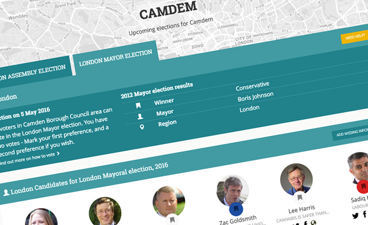
Dynamic "Election Mode" Logic
We developed a unique logic system that adapted the user interface based on the date and location. In "Normal Mode," the dashboard provides a general overview of a user's democratic footprint, including demographic insights such as unemployment rates and ill-health stats compared to national averages. However, as an election approaches, the system automatically triggers "Election Mode." This shifts the focus of the UI to prioritise upcoming ballots, candidate profiles, and polling station information, often integrated via crowdsourced data from partners like Democracy Club.
High-Performance Mobile App Engineering
To cater to the geographically mobile population identified by the LSE, the platform was built to HTML 5 standards, ensuring a seamless experience across all devices. We implemented advanced caching technologies to handle 5,000 concurrent users per minute. By optimising how the database queried nested geographical levels, we ensured that entering a single postcode would instantly resolve to the correct ward, local authority, and Westminster constituency.
Accessible Public Sector UX
Designing for the government and public sector requires a deep focus on accessibility. We created a clean interface that utilised localised photographs and clear data visualisations. We used CSS 2.0 and 3.0 to ensure compatibility across older browsers and mobile devices, including support for legacy Android and iOS versions. This ensured that no voter was excluded from accessing vital information due to their hardware.
The Results
The Democratic Dashboard became a landmark success for the LSE Public Policy Group, evolving through the 2016 and 2018 election cycles to become the premier voter resource in the UK. By bringing together data from the House of Commons Library and the Electoral Commission, the platform successfully bridged the information gap for millions.
Massive User Reach: During the 2015 campaign alone, the site saw almost 250,000 individual visits, proving the demand for accessible data.
Operational Efficiency: The new CMS allowed the LSE team to perform bulk data updates in minutes, ensuring the site reflected real-time candidate changes and election results.
OECD Engagement: By simplifying the "patchwork" of UK democracy, the Dashboard directly addressed the participation crisis among young voters.
Long-Term Utility: The platform was built to facilitate the addition of future election data, adapting easily for the 2017 and 2018 elections and beyond.
The project established a permanent digital infrastructure for UK democracy, transforming complex spreadsheets and PDFs into an engaging, interactive, and vital public service.
Technical Highlights
CMS: ExpressionEngine for enterprise-grade content and data management.
Backend: PHP 5 with a highly optimised MySQL database architecture.
Frontend: HTML5, CSS 3.0, and JavaScript for responsive, cross-browser compatibility.
Mapping: Custom implementation of map-based data illustrations using regional boundary datasets.
APIs: Integration with Democracy Club and YourNextMP.com for real-time polling station and candidate data.
Social: Full integration of Twitter Cards and Facebook Open Graph to drive viral sharing of localised data.
Need a high-performance web system for your organisation?
From complex data visualisations to robust CMS builds, we help public sector and commercial clients build digital tools that scale.